Monday, November 16, 2009
Saturday, May 30, 2009


Philosophy of Art: From the Beginning to the End
Art.
It is completely subjective, but yet we have a whole world of people who study and analyze it. There are so many variations, but people/scholars still try to classify it. Through this class, we are taught to distinguish pure taste with art criteria, and it is the most interesting journey.
Ahhh, the Saatchi Gallery.
I have never even heard of this place before Professor Manley took us, and yet it has a very dear spot in my heart. Some of the most disturbing, controversial, yet beautiful pieces I have ever seen.
I have never even heard of this place before Professor Manley took us, and yet it has a very dear spot in my heart. Some of the most disturbing, controversial, yet beautiful pieces I have ever seen.

I tend to choose pieces that have an emotional attachment to me, or are visually pleasing to my eyes. This piece really touched me, because it's how I feel sometimes. A drone of many other similar persons, and completely hollow and empty on the inside.

I love the openness of all the rooms in the Saatchi Gallery. Really allowed us to zoom in on the pieces.

The fluffy clouds to Tate Modern were so pretty!One of the best days in London that I could remember.

Tate Modern! Another one of my top favorites. I actually really enjoyed the black and highlighter yellow walls that act as a transition from one theme to another.

National Gallery. I wasn't a fan of classic art, but I actually enjoyed this exhibition simply for the aesthetics of it all. Each room was done in a very classy way, where I felt like I was in a Duke's manor, staring at his collection of artworks. I started to realize that although it was not my original cup of tea, I can appreciate it for the amount of time and effort it takes to create such a masterpiece.

Turner/Rothko Exhibit. I loved this room! How the colors, depending on what the background is, completely changes the feel of each canvas. Amazing!

Food Aesthetics at TAS. Good food paid for by class? Already my earbuds were perking up. I always wanted to be a food critic, and this was fun to choose a different medium to discuss art and taste.

Romeo and Juliet. Although I didn't enjoy it, I liked being able to watch a Shakespearan play the way it was originally done! Again, going along with theme that although I do not prefer the play, I can appreciate it for what it is.


Geocaching: From Start to End
I never could have imagined that I would be experiencing London's nooks and crannies in a class. Dr. Manley's Geocaching class has been such an amazing adventure crawling through trees and uncovering London's history and puzzles.
A quick Geocaching Glance through Time...
Our first geocache ever at the John Snow Pub! I really had no idea what we were doing besides having the slightest knowledge that it was sort of like a scavenger hunt. And so it begins...

A part of the Catastrophe series. Monument! I hate exercise so the climb up was not appealing, but it was great to be able to see this on the very first week we were here. It's amazing how I was so lost as to where we were at this stage, and now everytime I see Monument on the tube, I know exactly what's off the exit.

Doing this part of the Catastrophe cache by myself, I was so scared that I was going to get caught! I felt like Sherlock Holmes on the search for some clues. The roads leading here were unpaved as well, and it was like a ghost town. I definitely would not have wanted to look in this area without geocaching.
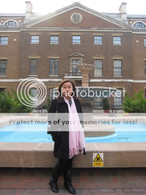
I also really enjoyed exploring Regent's Park for the last cache in the Catastrophe series. If it wasn't for geocaching, I would not have taken the time out to see this gorgeous park! I hate physical exercise though, so this was the longest journey in life!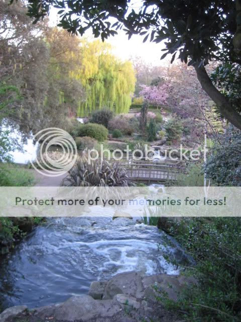

Greenwich. I love explaining to everyone in the internship program and at home about the history of the Prime Meridian. I learned to read a GPS here, and the Observatory is definitely not where it is 0 degrees longitude!

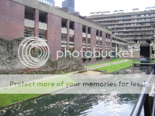
Roamin' the Roman Wall! This was one of the highlights as well. It was quite a puzzle to fill in the remains of the Roman Wall. It's crazy how Londoners have built around the remaining parts of the Wall. New against the very old, I love it.
The flowers are so gorgeous in London! I saw this patch next to the Roman Wall. The levels of different flowers of the same color within the same garden bed is very unique, I've never seen it anywhere else.

I really enjoyed this secluded pond area next to the Roman Wall Walk. If I ever needed a place to contemplate, I would definitely come here.

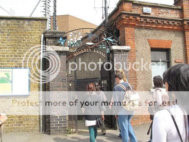
Regent's Canal geocache was one of my favorite geocaches that we did. I had no idea that London had a Little Venice, and I long to take my significant other to the restaurant on the Canal. It's a shame that the Boat House restaurant is so exclusive and expensive.

I was pretty excited to be able to find this secluded entrance for one of the Regent's Canal caches. We would have definitely passed by it without thinking much of it.
My first time at Camden Market, and it's all because of geocaching! I knew I was going to come here soon, but I would have never thought that it used to be a horse hospital.

My first time doing a cache without any collaboration any from my classmates. Sherlock Holmes 3. Without a GPS and internet, I blindly stumbled upon Temple Church. When I got there, I couldn't find the plaque for the life of me, so I had to go home and come back another day. There were 3 last names that could have been the answer, so I had to input in all possible combos into geocaching.com. This was a tough one, especially since I forgot how to read roman numerals (it was in the thousands!)

A great way to end our geocaching class: Abbey Rd! I have been wanting to go here before I leave, and I loved how my prayers were answered with geocaching! It combined everything that geocaching has to offer: a wonderful place of interest, and a delicious history to boot.

Friday, May 22, 2009
Master-Pupil Evaluation
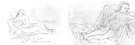
Which one is a Picasso?
The answer must be the one on the left.
Rosenberg's Criteria of Excellence:
Line and Tone: Minimalism is key here. The sketch on the left has lines that are precise, each one performing a task to enlarge the bigger picture. The sketch on the left has alot of unecessary lines that can easily be erased without feeling like a piece of the sketch is missing. The lines are drawn in so deeply on the right, like a child who cannot grasp the pen masterfully and must hold it forcefully so to not lose hold of it. The sketch on the right is drawn daintily with grace and elegance, as a woman with child should be perceived.
Form: There is a difference of contrast in the left sketch to show what should the viewer zoom in on. It is obvious what is in the foreground and what is in the background, whereas the sketch on the right it takes a couple seconds to zoom in one the figure of the woman. There are so many dark lines surrounding the sketch that it is hard to see. The female form is also drawn more grotesque in the second sketch, like the woman is ready for prostitution. The sketch on the left draws it much more artistically and beautifully, where a woman is symbolized as more of a flower and a nuturer than the one on the right.
Space: The background shows that the woman is lying in a meadow, tending to her child, in a very matriarchal mood, whereas the second sketch shows the woman laying on some not romantic sheets.
Expressiveness: The woman on the left's body is much more natural than the one on the right. The one on the right looks like an amateur because the shoulder lies straight but it is meant to be leaning naturaly. The body feels very stiff and awkward. It is unsure of what emotion she is trying convey. Her face looks mean and harsh, while the one on the left is a gentle mother.
Picasso's sketch must be the one on the left.
Rostropovich vs. Yo-Yo-Ma
Ludwig Von Beethoven's Cello Sonata No. 4
 In Yo-Yo-Ma's interpretation, the piano was the main focal point. I did not get the same storyline from his recording. Piano and cello played harmoniously together, with a light and airy balance between the two. Reading on wikipedia, it stated that Beethoven wrote this piece in his time of hardship, as his deafness became more prevalent. This conflict in him brought him to write No. 4. I did not feel the conflict Yo-Yo-Ma's interpretation. It was played much slower, without as much fervor. This piece would be something nice to listen to after a nice dinner and in time for coffee, but not emotional enough for a soundtrack. There was a story behind the Rostropovich's piece, and I enjoyed the emotional attachment to it instead of Yo-Yo-Ma's interpretation.
Rostropovich and Yo-Yo-Ma each interpreted Beethoven's piece with grace. I felt that Rostropovich's Cello Sonata was more captivating because the piano and the cello played off each other. It was like the cello was a man, and the piano was a woman. He tries to romance her in the beginning, creeping up to her like a delicate flower, and romancing her as much as possible. He then gets the girl, but there is confrontation about. They get angry, make up, and fight all over again. It is the classic love story, of happiness and conflict, working together harmoniously. The cello stated its prominence, and the piano accompanied it.
In Yo-Yo-Ma's interpretation, the piano was the main focal point. I did not get the same storyline from his recording. Piano and cello played harmoniously together, with a light and airy balance between the two. Reading on wikipedia, it stated that Beethoven wrote this piece in his time of hardship, as his deafness became more prevalent. This conflict in him brought him to write No. 4. I did not feel the conflict Yo-Yo-Ma's interpretation. It was played much slower, without as much fervor. This piece would be something nice to listen to after a nice dinner and in time for coffee, but not emotional enough for a soundtrack. There was a story behind the Rostropovich's piece, and I enjoyed the emotional attachment to it instead of Yo-Yo-Ma's interpretation. Sunday, May 17, 2009
Romeo and Juliet Review
Romeo and Juliet is undoubtedly the most popular play where Shakespeare is concerned. Watching it the way that Shakespeare meant for it to be shown, in the Shakespeare Globe, was supposed to be a very enlightening experience where we can go back in time to the Victorian era. Unfortunately, I did not enjoy this play as much as I thought I would. I remembered reading and analyzing the play in my English AP class back in high school, and this was not how I pictured it to be. Considering that this rendition was in the Shakespeare Globe, I thought that it would be more fitting for Romeo and Juliet to resemble close to how Shakespeare would have wanted it done. I felt it was unorthodox to have both Romeo and Tybalt played by Black actors. I am not racist in the least, but when the rest of the Capulet and Montague family are completely white, this makes the storyline less believable. When we first saw the beginning scenes of the play, I was trying to guess who was which character, and I thought that since Juliet was played by such a young actress, that the actor who played Benvolio would be better suited for the role of Romeo. In Romeo's defense, he played the role passionately and with vigor, but I honestly thought he was an understudy throughout the remainder of the play.
My biggest criticism of the play was that it was played much too lightly for the arena that it was shown. I enjoy variations of Romeo and Juliet, but I felt that this may have been better suited for an Off-Broadway play, not in the Shakespeare Globe. The sexual conotations were much too vulgar for a place where parents bring their little children to experience the original magic of one of the greatest playwrights of the English language. I would not feel comfortable bringing my children to this, nor expect it from this kind of arena. I also did not understand the costuming of Romeo's character. I felt that his cream costume when he was in "exile" was confusing, when his earlier maroon costume (for when he went to the Capulet Ball) was not as extravagant. It doesn't make sense to be wearing more embellished clothing in that time. I do, however, understand that he must wear the maroon to symbolize he is a Montague, but perhaps the costume designer could have chosen a different fabric or cut.
There still were many parts that I did enjoy. I loved the stage: it was interesting to see how little props can carry the scenes throughout the entire play. I have only seen Romeo and Juliet in movies, where there was more money spent on the background. Like when Shakespeare must have directed it, little props and great actors are what make the play vivid to the audience. I was easily entranced by the play, even without the expensive props. I thought that Juliet was believable because women in her time were married off much earlier to much older men. Although this was not how I pictured watching Romeo and Juliet in Shakespeare's Globe, it was still a memorable experience that I will never soon forget.
Tuesday, May 12, 2009
Bloomsbury Group Project
http://www.panoramio.com/map/?user=3201043#lt=51.397287&ln=0.0312445&z=7
I tried using Panoramio, but I found that using Google Maps was easier.
Here's the link to my Panoramio.
I thought my Google Maps one
(with all of the Bloomsbury Group addresses I can find, by year)
was easier to interpret. I put pictures in there as well.
I
View Bloomsbury Group in a larger map
List of Bloomsbury Group (From Tate.org.uk)
1. Helen Anrep
2. Clive Bell
1920-1922: resides in
3. Vanessa Bell (Stephen)
1904-1907: moves into
1907-1922: stays at 46 Gordon Square w/ husband Clive while Virginia and siblings move out.
1920-1922: resides in
4. Quentin Bell
5. Frederick and Jesse Etchells
6. Roger Fry
1913-1919: Roger Fry’s Omega Studios at
7. Angelica Garnet
8. David "Bunny" Garnet
9. Duncan Grant
1907-1911: his studio at
1907-1911: resides at
10. Mary Hutchinson
11. John Maynard Keynes
12. Lytton Strachey
1909-1924: resides in
13. James Strachey
1919-1956: resides in
14. Leonard Woolf
1911-1912: moves to
1912: marries Virginia Woolf
1924-1939: home w/ wife Virginia at
1939-1940: moves to
15. Virginia Woolf (Stephen)
1939-1940: moves to
1904-1907: moves into
1907-1911: Virginia and brother Aiden’s reside in
1911-1912: moves to
1912: married Leonard Woolf
1924-1939: home w/ husband Leonard Woolf at
1939-1940: moves to
The Bloomsbury Group consisted of many brilliant literary individuals who all seem to have a common bond of some sort. Many met at the Cambridge University while studying, and later lived together. They shared not only a common bond of literature, but also relations with each other. Their sexual explorations are represented in their respected arts, and it was fun to see how close of a proximity they were all to each other. Like a college fraternity or sorority, they fraternized with each other, and made history along with it.
Citations:British Museum + Poetry Interpretation
1. The British Museum's Architecture
The reconstruction of the Great Court in the British Museum feels like a lovely medley of two of the greatest countries' architectural feats: the glass pyramid at the Louvre in Paris, and Roman columns from Italy. The equilateral triangle has always represented the strongest shape in architecture, reinforced on all sides perfectly, and as the holy trinity in mythology. Foster's choice of creating the glass ceiling provides both a symbolic and beautiful escape from the sometimes overwhelmingly powerful artefacts and artworks at the British Museum, allowing visitors to look to the skies and beyond for a nice little breather. The centerpiece of the Great Court, with its sprawling majestic staircases, leads up to what I would have thought to be used as the most prestigious exhibition, ends up being only a restaurant terrace. I was sadly disappointed. There is so much intricacy in the Great Court: from the curled detail of the top of the Roman columns on all 4 archways, to the Roman lettering of Queen Elizabeth's name on the centerpiece... I enjoyed it all. Combining French and Italian architecture, Foster brings together the true symbolism of the British Museum and perhaps London in itself: the Museum and the City is a melting pot of all the great works and cultures of our time, as one look into the British Museum, we can see how diverse (from all of the overseas conquering, I'm sure) the country has truly become...
2. Vita Sackville-West's "And so it ends..."
One poem that truly caught my eye in class was Sackville-West's vividly emotional poem on the end of relationships. Doing the Bloomsbury Group Project, I learned that Vita Sackville-West had romantic interests with both female and male counterparts, and I wonder who this poem was about. Perhaps Virginia Woolf? The poem flows like a song, and I can imagine a contemporary artist making a musical rendition with these words.
This phrase can be vividly pictured in my brain. I see a person being touched by his or her lover, and still remembering the feeling like it was yesterday.
The Bloomsbury Group's sexual discovery of each other seems to be epitomized in this poem by Sackville-West, as they were married and had different partners, and I can imagine Sackville-West's emotional confusion and distrought with it all in "As it ends..."
The reconstruction of the Great Court in the British Museum feels like a lovely medley of two of the greatest countries' architectural feats: the glass pyramid at the Louvre in Paris, and Roman columns from Italy. The equilateral triangle has always represented the strongest shape in architecture, reinforced on all sides perfectly, and as the holy trinity in mythology. Foster's choice of creating the glass ceiling provides both a symbolic and beautiful escape from the sometimes overwhelmingly powerful artefacts and artworks at the British Museum, allowing visitors to look to the skies and beyond for a nice little breather. The centerpiece of the Great Court, with its sprawling majestic staircases, leads up to what I would have thought to be used as the most prestigious exhibition, ends up being only a restaurant terrace. I was sadly disappointed. There is so much intricacy in the Great Court: from the curled detail of the top of the Roman columns on all 4 archways, to the Roman lettering of Queen Elizabeth's name on the centerpiece... I enjoyed it all. Combining French and Italian architecture, Foster brings together the true symbolism of the British Museum and perhaps London in itself: the Museum and the City is a melting pot of all the great works and cultures of our time, as one look into the British Museum, we can see how diverse (from all of the overseas conquering, I'm sure) the country has truly become...
2. Vita Sackville-West's "And so it ends..."
One poem that truly caught my eye in class was Sackville-West's vividly emotional poem on the end of relationships. Doing the Bloomsbury Group Project, I learned that Vita Sackville-West had romantic interests with both female and male counterparts, and I wonder who this poem was about. Perhaps Virginia Woolf? The poem flows like a song, and I can imagine a contemporary artist making a musical rendition with these words.
Your meeting touch upon the string
That still was vibrant, still could sing
This phrase can be vividly pictured in my brain. I see a person being touched by his or her lover, and still remembering the feeling like it was yesterday.
This phrase feels like it was taken right out of a modern day Emo Acoustic music genre band, like Good Charlotte or Blink 182.Would slash me with a naked knife
And gently tell me not to bleed
The Bloomsbury Group's sexual discovery of each other seems to be epitomized in this poem by Sackville-West, as they were married and had different partners, and I can imagine Sackville-West's emotional confusion and distrought with it all in "As it ends..."
Thursday, April 30, 2009
Portrait Gallery Aesthetic
1) Photography is completely subjective, and using my own aesthetic, I would prefer an exhibit of very few but large pieces. 2 walls of the exhibition will be painted black, while the other 2 are painted white. The lighter photographs will be placed against the black backdrop, and vice versa. Like in the National Gallery, I loved how each room's decor enhanced the paintings itself, and I would like to incorporate that aesthetic into my own exhibition. I always liked photos that overwhelm and draw the attention of the viewer from afar, so that the viewer will approach it just to see the details. I enjoy the theme of Love, and I think I would post up photographs in either black/white or Kodak color of images of Love. The photographs will be printed on canvas, like a painting, because I like the matte look that this creates. Like in the Schindler's List, I enjoy black and white pieces with a pop of color. I think I would definitely incorporate that into the exhibition.
2) 3 Pieces...
a. Wolfgang Tilman's Paper Drop... Lighter 82
Standing from Andy Warhol's popart pieces, I look left, and am shocked to think what my eyes are seeing. Could it be? Another vulgar depiction of the human genitalia? I look closer and sure enough, nothing could convince me otherwise. The slight creases in the stark peachy skintone photo were strategically placed to show the female V, the ovaries, and the vaginal area. It's amazing what a few creases and a skin match can do to a square sheet of paper.
b. Maurizio Anzeri's collection
People in still photos like the ones that Anzeri has on display tend to try to look the best they can be. In the past, portraits were painted, and now photographs are taken, to show good memories, but what if the depiction is incorrect? What is the point of having memories that only put the person photographed in a good light, and they really are not? My view of the Anzeri collection was that he used string to depict animalistic sentiment in the ones photographed. Although they dress up, put on their best attire, in hopes to capture a happy, sophisticated perosn, they are still animals in the essence: I saw an elephant, a monkey, and a bird. I feel that he is telling us to go outside of our element, to get out of the black and white (photos,) and be vibrant (by using the colorful string) in our lives.
c. Walead Beshty
Walead Beshty's 4-sided pull was extremely abstract, with 4 different layers of photographers intermeshing with each other to create a scenic piece. The top layer of vibrant cubic colors looked like I was seeing into a stained glass window, a very beautiful, dreamy stained glass window. Parts of one of the layers felt burned, and these represented the people walking alongside the blue stream. The piece was extremely intricate to do, and although crowded with color and movement, came together nicely. There was a central theme of peace and serenity, with people wandering around like there wasn't a worry in the world. I would love to have this piece in my home, it would be absolutely amazing!
Whitechapel + National Gallery
Going to Whitechapel was quite a culture shock. I've never been in an area that was very Muslim/ethnic before, and it was interesting to see all of the fabric shops in the area. Although I personally do not lust for these kinds of unique designs, I'm always appreciative to see it all. At Whitechapel, Guernica and the round table of information in the same room really fascinated me. I sat there for the remainder of our time there because there was so much fun facts on people's political reactions to the G20 summit, to the history and responses of Guernica when the tapestry was created. I was exposed to Guernica in my Spanish class back in high school, but I had no idea that Guernica was so influential and had such an impact on people outside of those who were affected by the Spanish Civil War. Looking at it again, it really is such a sign of peace and anti-war sentiment. Who wants to fight when this painting depicts such horrid graphics of war?
The National Gallery was absolutely stunning from the exterior to the interior, architecturally speaking and from the gorgeous paintings it housed. I loved how the museum walls were all so grand and luxurious feeling, like I was in a Duke or some other type of royalty's home. Salome Receives the Head of John the baptist touched me. One would imagine that a depiction of any Baptist or holy member of the church would be painted in a more saintly way. John the Baptist in this painting seems very mean and angry, while all of the other depictions of him in other paintings around the same room were much nicer. The woman in the back was also depicted differently in other paintings in the same room: sometimes she's the mother and sometimes sh'es the friend, but they were all not as ghostly. It feels that the artist Caravaggio had a very strong distaste for this scene and everyone in the portrait was painted unfavorably.
The National Gallery was absolutely stunning from the exterior to the interior, architecturally speaking and from the gorgeous paintings it housed. I loved how the museum walls were all so grand and luxurious feeling, like I was in a Duke or some other type of royalty's home. Salome Receives the Head of John the baptist touched me. One would imagine that a depiction of any Baptist or holy member of the church would be painted in a more saintly way. John the Baptist in this painting seems very mean and angry, while all of the other depictions of him in other paintings around the same room were much nicer. The woman in the back was also depicted differently in other paintings in the same room: sometimes she's the mother and sometimes sh'es the friend, but they were all not as ghostly. It feels that the artist Caravaggio had a very strong distaste for this scene and everyone in the portrait was painted unfavorably.
Tate Britain Aesthetic
The Tate Britain is yet another beautiful museum situated in the heart of London.
1.) My aesthetic is minimalistic. I do not appreciate art that is too cluttered: simplicity soothes me. I enjoy simple lines, too much detail going on all at once just confuses me. I like choice colors, too much color only distracts the eye. I enjoy a single or a select few focal points, so that we, as viewers, can appreciate what the artist is trying to say without having to look at all of the other fine points. I need to find a strong emotional attachment for me to appreciate a piece. I feel blank without it, even if I applaud the artist for his or her fine attention to detail, I can't enjoy it without feeling connected to it.
2.) In the Turner/Rothko Exhibit, I enjoyed Rothko's work better than Turner. Walking into the first room, I thought that I would enjoy Turner's work more because he had a more visually compelling look on portraying seascapes. I enjoyed the more defined lines, but as I moved through the exhibits, although I saw the difficulty of his modernist approach to his depiction of nature, the colors blended together too much for me and became a blur. On the other hand, the Rothko room's exploration of the colors of maroon, black, and red, oddly touched me. It is amazing to see that these colors, all very dark, and somewhat related, can evoke such different feelings, when paired with each other. Each painting felt like it was an open doorway leading into something. Depending on the color scheme, the doorway may feel ominous or inviting.


Turner and Rothko both shared a passion for painting natural landscapes, like seascapes and fields, and both used minimalist strokes to evoke the image. Turner used very subdued colors, it seems that his favorites are shades of yellow, green, and blue. Rothko used bright colors with even less strokes than Turner. Rothko's paintings did not feel as romantic as Turners, with Turner's subdued and light touches in his paintings. Turner's aesthetic did feel more impressionistic at times, especially walking further and further into the exhibit. Although he was modern in the sense that he used thicker strokes to create an image, it was obvious what the painting was without much effort. It takes some time to realize what Rothko was trying to portray. Both artists are amazing, especially Turner for being so modern so many years back, but I still enjoy the stronger impression that Rothko left on me.
On a sidenote, I walked up to the drawing room that features Turner's sketches, and I must admit that what he does is quite difficult. I tried to mimick his sketches, and that ended quite miserably!
http://blogs.mirror.co.uk/the-ticket/2009/03/art-bp-british-art-displays--.html
Wednesday, April 29, 2009
The Victorian Underclass


What does one do when there is a 4% surplus of women in Victorian Age London, with no men to marry and support them, and a tight restriction on the types of jobs suitable for women? Therein lies the Victorian underclass era conundrum.
The times were good for the British empire: huge profits from overseas conquests, large, educated middle class, and a long period of peace. Unfortunately, with huge industrialization comes massive amounts of laborers willing to work, and not enough jobs or high enough wages to support them. The East End of London was flooded with Russian and German Jews looking for work and to escape persecution in Eastern Europe. Only half of the children in London went to school, and the other half were expected to contribute to the family income. Women were not spared either. Although women are perceived as delicate, porcelain dolls, meant to clean the home and tend to the children, this was not possible without a family to be responsible for. With an imbalance of available men, they must support themselves with any means possible. All respectable jobs were reserved for the middle class men, with women allowed to be nurses, factory workers, or telephone connectors later on. These jobs were for the middle class and up, so what are those in the under class supposed to do? There simply were not enough jobs to go around, and the growing pressures of economic prosperity lead to the popularization of prostitution.
Reading all of the articles on Jack the Ripper and the roles of women in the Victorian era, it is a recurring theme to see that Jack is a symbol or twisted solution to the socio-economic problems of the area that he lived in. Government wanted a way to clear the East End of the problem of prostitution, and I'm sure more than one of them wished these prostitutes would just...disappear. Jack the Ripper literally did just that, by killing them and destroying the evidence. Whether his stories are fabricated or real, they brought awareness to the lack of police/government control, the overbearing problem of prostitution, and the cramped economic pressures of rapid urbanization in metropolises like London.
"Jack the Ripper highlighted many of the problems in Victorian society and instigated debate over social reform, particularly in relation to the social conditions in East End London." Casebook.http://en.wikipedia.org/wiki/Victorian_era
http://en.wikipedia.org/wiki/Women_in_the_Victorian_era
Thursday, April 23, 2009
TAS Restaurant Review

When I heard that we were eating Mediterranean food for our Aesthetics dinner, I imagined a dingy restaurant with bad lighting and poor hygiene, but amazingly flavourful food. As I turned the corner to enter Tas's brightly lit dining room, you can definitely say that I was pleasantly surprised. The ambience of the restaurant, with its clean, linen white color pallete, and open, airy cathedral ceilings, is relaxing with a Mediterranean seaside feel.
When we first sat down, the olives and bread made me believe that this was just any typical Mediterranean restaurant, but I was told that it was Turkish. Not ever having tried Turkish food, I looked at the menu with an open mind. I was not pleased with the presentation of the menu, as I believe that's where the creativity of a restaurant can come into play, in print. I let them slide because it was the group menu, and I didn't get a chance to see the actual one. Now onto the good stuff, the FOOD:
 Humus:
Warm, cream colored consistency, with a sprinkle of vibrant green garnish and a drizzle of rich olive oil. The taste was creamy, different from the thicer texture I'm used to. The bread was absolutely delicious to dip it into, and it made quite a nice pairing.
Zeytin Yagli Patlican:

My absolute favorite! It was a pleasant surprise to taste the eggplant without seeing its normal purple color. Instead, the food was an extremely bright orange color, reminiscent of a nice red curry. I was instantly drawn to its savory smell and just as equally savory taste. This may be because I am extremely partial to eggplant (or aubergine in the UK.)
Tabule:

Very gorgeous presentation of bright greens and warm couscous, with a red tomato garnish kick. Unfortunately, my least favorite just because I am not a fan of the tan of greens used in this dish. The flavors do not mesh well with my Asian taste palate, but the lettuce cup on the side sure looked tasty!
Manca:

Being naturally a little queasy with dairy products, this dish did not appeal to me at all. I do not like white colored foods because it reminds me of milk, and this dish did just that. Its creamy cottage cheese consistency looked like baby food, and I did not enjoy the taste either.
Zeytin Yagli Bakla:

I enjoyed this dish because it reminded me of a Chinese dish that my mom would cook back at home, giving me an emotional attachment. The green broad beans glistened in olive oil and stared at me, waiting for me to eat them. It was delicious!
Falafel:
It honestly looked like a ball of turd. I've eaten many
 falafels in my day, and this one did not look very appealing at all. Other falafels I've seen are nice and golden, not brown. The taste was okay, not a lot of flavor, and I very forgettable.
Borek:
Again, cheese. I love very strong cheeses like cheddar and gouda, but feta cheese just does not float my boat. Like a typical American, I love my fried food, so the aesthetic was appealing. Unfortunately, when I bit in, I had to sadly decline. I love spinach, but the feta cheese overpowered the spinach and I was left unsatisfied.
Main course: Karides Guvech:

When I saw this item on the menu, I knew I had to order it. I am always a fan of tomato sauces, and mushrooms are absolutely amazing. The plating was okay: the color of the sauce was very vibrant and caught my eye, making it appealing to eat, but other than that, it felt like alot of food was just thrown onto the plate with some garnish on top. Not much can be done with such a saucy item, so they can't be marked off for that. The taste, however, was absolutely amazing. I love tangy sauces, and this was just the right balance between salty and sour. I could eat this with any kind of carb, it wouldn't matter!
Conclusion:
Overall, the meal was very satisfying and a good time was had. The service was alittle too attentive, perhaps because we were such a large group and they wanted to clear us for the next round, or they just were not busy at that time. The waiters just sat around waiting to clear our plates, and it felt alittle overbearing. Other than that, the ambience, the food, the company, was just right, and I would definitely come back again.
London Wall + Greenwich
London Wall:
Who would have thought that a bunch of old stones would tell a tale from thousands and thousands of years ago? The London Wall is such a pivotal part of London history because without it, London may not have existed today. The Romans chose to develop their empire in Londonium because of its location, and in order to protect the area that they had chosen, they must build some sort of defense from the barbarians like the Saxons. Metaphorically, it kept London, London. If another ruling country overruled London, then the area would have a completely different culture. Many of its past gates are names of tube stations: aldgate, moorgate, which I find very humorous.
Greenwich:
Greenwich was super fascinating because I thought that going to Greenwich would be like going to Greenwich village in New York: a posh, urban area much like Camdentown. Little did I know that it was an olden naval base, and the site of the prime meridian. The trek up the hill left me gasping for air, but it was much worth it. Not many of my friends can say that they've been to the fake and REAL prime meridian of the world!
Who would have thought that a bunch of old stones would tell a tale from thousands and thousands of years ago? The London Wall is such a pivotal part of London history because without it, London may not have existed today. The Romans chose to develop their empire in Londonium because of its location, and in order to protect the area that they had chosen, they must build some sort of defense from the barbarians like the Saxons. Metaphorically, it kept London, London. If another ruling country overruled London, then the area would have a completely different culture. Many of its past gates are names of tube stations: aldgate, moorgate, which I find very humorous.
Greenwich:

Greenwich was super fascinating because I thought that going to Greenwich would be like going to Greenwich village in New York: a posh, urban area much like Camdentown. Little did I know that it was an olden naval base, and the site of the prime meridian. The trek up the hill left me gasping for air, but it was much worth it. Not many of my friends can say that they've been to the fake and REAL prime meridian of the world!
Whitechapel + National Gallery
Whitechapel:
Going to Whitechapel was quite a culture shock. I've never been in an area that was very Muslim/ethnic before, and it was interesting to see all of the fabric shops in the area. Although I personally do not lust for these kinds of unique designs, I'm always appreciative to see it all. At Whitechapel, Guernica and the round table of information in the same room really fascinated me. I sat there for the remainder of our time there because there was so much fun facts on people's political reactions to the G20 summit, to the history and responses of Guernica when the tapestry was created. I was exposed to Guernica in my Spanish class back in high school, but I had no idea that Guernica was so influential and had such an impact on people outside of those who were affected by the Spanish Civil War. Looking at it again, it really is such a sign of peace and anti-war sentiment. Who wants to fight when this painting depicts such horrid graphics of war?
National Gallery:
The National Gallery was absolutely stunning from the exterior to the interior, architecturally speaking and from the gorgeous paintings it housed. I loved how the museum walls were all so grand and luxurious feeling, like I was in a Duke or some other type of royalty's home. Salome Receives the Head of John the baptist touched me. One would imagine that a depiction of any Baptist or holy member of the church would be painted in a more saintly way. John the Baptist in this painting seems very mean and angry, while all of the other depictions of him in other paintings around the same room were much nicer. The woman in the back was also depicted differently in other paintings in the same room: sometimes she's the mother and sometimes sh'es the friend, but they were all not as ghostly. It feels that the artist Caravaggio had a very strong distaste for this scene and everyone in the portrait was painted unfavorably.
Going to Whitechapel was quite a culture shock. I've never been in an area that was very Muslim/ethnic before, and it was interesting to see all of the fabric shops in the area. Although I personally do not lust for these kinds of unique designs, I'm always appreciative to see it all. At Whitechapel, Guernica and the round table of information in the same room really fascinated me. I sat there for the remainder of our time there because there was so much fun facts on people's political reactions to the G20 summit, to the history and responses of Guernica when the tapestry was created. I was exposed to Guernica in my Spanish class back in high school, but I had no idea that Guernica was so influential and had such an impact on people outside of those who were affected by the Spanish Civil War. Looking at it again, it really is such a sign of peace and anti-war sentiment. Who wants to fight when this painting depicts such horrid graphics of war?
National Gallery:

The National Gallery was absolutely stunning from the exterior to the interior, architecturally speaking and from the gorgeous paintings it housed. I loved how the museum walls were all so grand and luxurious feeling, like I was in a Duke or some other type of royalty's home. Salome Receives the Head of John the baptist touched me. One would imagine that a depiction of any Baptist or holy member of the church would be painted in a more saintly way. John the Baptist in this painting seems very mean and angry, while all of the other depictions of him in other paintings around the same room were much nicer. The woman in the back was also depicted differently in other paintings in the same room: sometimes she's the mother and sometimes sh'es the friend, but they were all not as ghostly. It feels that the artist Caravaggio had a very strong distaste for this scene and everyone in the portrait was painted unfavorably.
Infrastructure + Regent's Canal
Question:
After geocaching along this route, ask yourself a question involving London infrastructure and then answer it using your common sense as confirmed by at least one source like Wikipedia.
Answer:
Since the City of London is so large, a very detailed infrastructure must be used to efficiently operate the needs of its millions of patrons. In order to get from the River Thames to Paddington arm, the Regent's Canal was created for increased transportation for both goods and people. I thought that, because of London's problem with the sewage and water waste, that the Canal was created for the clearing of it all, but it wasn't at all. The Canal is frequently used for cycling and running (which we saw a lot of when we do our geocache,) underground cables for electricity to the city, and waterway transportation.
Other forms of infrastructure in London include electric plants, rails, tubes, trams, and telecommunication services. London's infrastructure feels so much more organized than California's, with all of the public transit widely available.
http://en.wikipedia.org/wiki/Infrastructure_in_London
--
Regent's Canal...

is absolutely stunning!
Little Venice is the most gorgeous place, I even looked up the restaurant by the Canal called the Boathouse. Too bad it's over 50 pounds a person to eat there, or else I would have much enjoyed it. Perhaps Aesthetics Dinner #2 there? :)
I absolutely loved the palatial estates alongside the Canal on our way to Cache #9. Depending on the cultural reference, each unique estate
 had its own flavor. My favorite was the Roman-inspired home that resembled that of the Pathenon. How amazing would it be to live in the Pathenon?! With steps leading down to the canal, I can just picture the types of royal dukes and duchesses that would stroll down to the Canal to ride it to work, perhaps just like the royalty did on the Thames.
Thursday, April 16, 2009
Tate Modern and Saatchi
Tate Modern and Saatchi Gallery are both modern museums, but are so different in every way.
Saatchi Gallery showed so many disturbing and controversial pieces that affect us TODAY, and makes us truly question our current events, while Tate Modern has many historic modern pieces that are beautiful to look at but may not shock as like the Saatchi. I loved going to both!
The 3 pieces I enjoyed the most were from Saatchi:

 Sun Yuan and Peng Yu’s Old Persons Home exhibit on the bottom floor was staggeringly disturbing. I thought that they were real men, who all happened to viewing the Gallery at the same time. There must have been hours and hours poured into each Old Person’s details. They are each holding an item that has, in his past life, brought them to this weary, life-less state. Some carry alcohol bottles, perhaps denoting alcoholism in their lifetime, and some carry scissors, perhaps weary from a lifetime of workaholism as a barber. Some are dressed as old Navy veterans, while others in ethnic attire, but all share a common characteristic: they have been weathered by the experiences in their past. They are riding around in their little wheelchairs, just waiting for the day that it is their time to go to heaven. Perhaps the artists are trying to show that we are all slaves to society’s pressures or indulgences, and ask us to question whether or not our choices will be worth it when we are much, much older

Saatchi Gallery showed so many disturbing and controversial pieces that affect us TODAY, and makes us truly question our current events, while Tate Modern has many historic modern pieces that are beautiful to look at but may not shock as like the Saatchi. I loved going to both!
The 3 pieces I enjoyed the most were from Saatchi:

The Ghosts exhibit took an everyday object that we use everyday, and made aluminum foil into something so haunting. When I first walked into this room, I felt that the aluminum ghosts were all clones or avid followers of some kind of cult, kind of like a platinum KKK of sorts. Each has a hollow face because there is no originality in people anymore. We are all androids following a certain way of belief, because nobody wants to stand out from the pack. Let’s all bow our heads, face the same direction, dress the same, because everyone else is doing it.
 Sun Yuan and Peng Yu’s Old Persons Home exhibit on the bottom floor was staggeringly disturbing. I thought that they were real men, who all happened to viewing the Gallery at the same time. There must have been hours and hours poured into each Old Person’s details. They are each holding an item that has, in his past life, brought them to this weary, life-less state. Some carry alcohol bottles, perhaps denoting alcoholism in their lifetime, and some carry scissors, perhaps weary from a lifetime of workaholism as a barber. Some are dressed as old Navy veterans, while others in ethnic attire, but all share a common characteristic: they have been weathered by the experiences in their past. They are riding around in their little wheelchairs, just waiting for the day that it is their time to go to heaven. Perhaps the artists are trying to show that we are all slaves to society’s pressures or indulgences, and ask us to question whether or not our choices will be worth it when we are much, much older

Halim Al-Karim’s room filled with Lambda prints was the most emotional for me. By using a silk overlay on some of his prints, it showed a shadow cast of emotions that are not outwardly expressed by the models, but is often felt in the private quarters of their minds. The two I felt most passionate are the ones I have photographed to the right. The titles of their paintings are labeled Hidden War 2 and Hidden Victims. The top shows a beautiful girl who feels so ugly inside, perhaps because of trauma due to rape or some other kind of abuse. Can’t we all relate? The world thinks nothing is wrong with us, and yet on the inside we feel hideous. The bottom shows an Asian girl who has an internal battle: wishing to look a different way from who she is. It is not very apparent which photograph is the real girl, but either way, there are always days where we feel ugly, and some days we feel beautiful, and some days we just feel plain hollow.
Subscribe to:
Posts (Atom)